Tools Menu
Options
The Options dialogue allows you to change a range of settings that affect either all your Swiftlight files, or just the current (open) file.
The combination of customization controls available in this dialogue give you almost total control over colours, fonts, logos and other aspects of the look of Swiftlight’s outputs. In most cases*, this customization capability should allow you to align the look of Swiftlight outputs with your preferences or with the requirements of a company’s branding. (See also: Creating a Template).
(* There are possibly some circumstances (e.g. unusual font types) where a total alignment is not currently possible and we welcome your feedback so we can continue to develop this functionality).
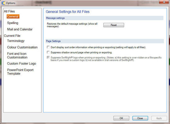
 General
Message Settings
(applies to all files)
Some message boxes allow you to check a box and always respond to the message in the same way. Pressing the "Reset" button in the dialogue restores the default message settings, ensuring you receive all the message prompts when you use Swiftlight.
Page Settings
(applies to all files)
When a view with a table that can be sorted is displayed, the sort order is displayed on the screen in the blue label row as "By Due Date" (or similar). The display of this sort order information on printed or exported outputs can be switched off by checking the box.
In the trial version of Swiftlight, the Swiftlight logo is displayed on the right side of the footer on printed or exported output. In fully licensed versions of Swiftlight, you can check the box to suppress the display of this logo.
On print or export from Swiftlight a light drop shadow appears around each page. You can suppress the appearance of this shop shadow by checking the box.
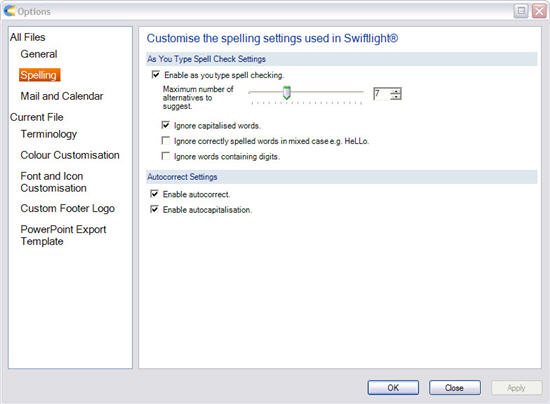
Spelling
The spelling option dialogue allows you to switch on and off the spelling and auto-correct settings. Words in the currently edited bullet or object that are not recognised will be highlighted with a squiggle under the word.
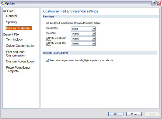
Mail and Calendar
When reminders are exported to your calendar, you will get a warning from your calendar tool before these events happen. You can configure how long in advance of the event you would like to see these warnings in this dialogue.
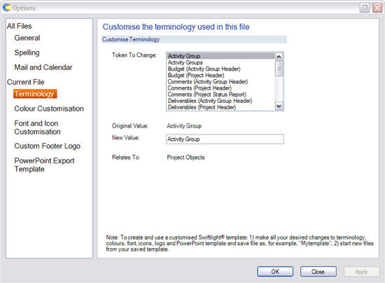
Terminology
Some organisations have a specific vocabulary to describe various elements of their projects and initiatives. This dialogue allows you to change some of the terminology in the current (open) file so that it matches your organizational environment or your preferences.
For example, you can change "Activity Group" to "Workstream", and "Activity Groups" to "Workstreams", and these changes will appear throughout the application in the current file. (See Creating a Template for how to use changed terminology across multiple files).
Colour Customisation
This dialogue allows you to control the colours used in the current (open) file, allowing you to align them with your preferences or with the requirements of a company’s branding. (See Creating a Template for how to use changed colours across multiple files).
To change a colour:
- Click on the selected square to open the colour selection dialogue;
- Choose a new colour from the dialogue and press OK;
- When you’ve made all your changes, press Apply or OK.
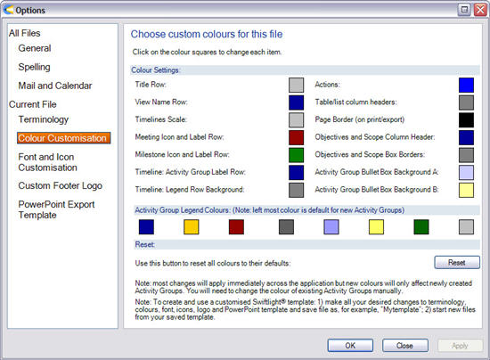
The colour settings in the main section of dialogue are described and also matched to examples in the graphics below:
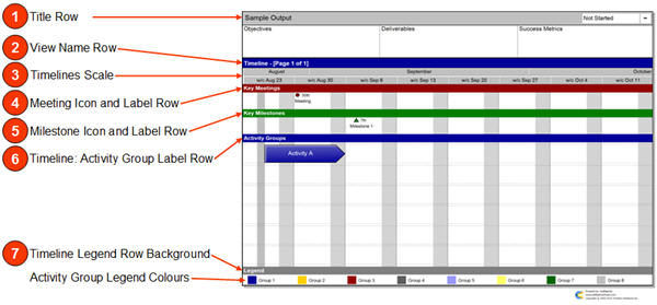
- Title Row: affects the grey in the top row across all views;
- View Name Row: affects the blue row with the View Name across all views;
- Timelines Scale: affects the grey of the timescale rows on the Timeline, Activity Group Detail and Action List over Time. This selection also affects the colour of non-working days on the timeline;
- Meeting Icon and Label Row: affects the red row for Key Meetings on the Timeline View and the colour of the circle icons for meetings on all views;
- Milestone Icon and Label Row: affects the green row for Key Milestones on the Timeline View and the colour of the triangle icons for milestones on all views;
- Timeline Activity Group Label Row: affects the blue row above the Activity Group section � only affects the Timeline View;
- Timeline Legend Row Background: affects the grey in the Legend row on the Timeline View;
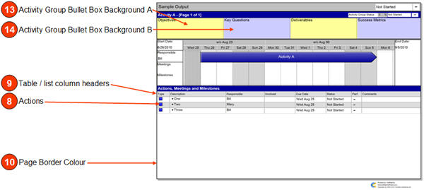
- Actions: affects the colour of the blue squares for Actions across all views;
- Table / list column headers: affects the grey colour of the column headers on the Activity Group Summary, Activity Group Detail, Action List, Contact List and Issue Log. Also affects the grey colour on alternating rows / column within the tables / lists in these views;
- Page colour border: affects the black page border on print / export on all views. Also affects the vertical dividing lines in the page header (e.g. between objectives and deliverables);
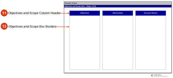
- Objectives and Scope Column Header: affects the blue in the areas at the top of each section in all the pages of the Objectives and Scope View;
- Objectives and Scope Box Borders: affects the colour of the black border around the text boxes on all the pages in the Objectives and Scope View;
- Activity Group Bullet Box Background A: affects the yellow background colour in some of the bullet boxes at the top of the Activity Group Detail View;
- Activity Group Bullet Box Background B: affects the yellow background colour in some of the bullet boxes at the top of the Activity Group Detail View.
Note: most colour changes will apply immediately across the whole application. However:
- Changed colours will only affect new Activity Groups; old Activity Groups will need to have their colour changed manually;
- In some circumstances new colours will not be displayed immediately. In this case, switching to another view and returning may update the colours, or you can close and re-open the file.
To reset colours:
- Pressing the Reset button will reset ALL the colours to the Swiftlight defaults;
- To reset only one colour and avoid losing other changes, you will need to know the original RGB setting. (Either make a note of the original RGB before you make a change or open a new Swiftlight file to identify the colour).
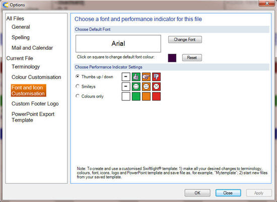
Font and Icon Customisation
This dialogue allows you to choose a default font type and colour and also the performance indicator for the current (open) file. (See Creating a Template for how to use changed fonts and icons across multiple files).
Font and Font Colour
- To change font, click on the �Change Font� button and select from the list of available fonts.
- To change colour, click on the colour square and select a new colour from the dialogue.
- Click the Reset button to return to Swiftlight’s default font colour selections.
- Select OK or APPLY to apply the change to the file.
Notes on Font and Font Colour
- A number of fonts have been blacklisted because they are either too big, too small or too strange to display effectively within Swiftlight. Some of the available fonts may display a little large / small on the page, but we expect that 95%+ of users will find their chosen fonts will display well. We also expect that we�ve missed a few fonts which, it will turn out, display poorly and should be blacklisted. Please let us know if you have any feedback;
- If you are going to change the font colour, we strongly advise using very dark colours since lighter colours may not display well in all areas in Swiftlight.
- When the new font is applied it should affect all items except those which have already had their font size, font type or colour changed.
- It is possible that new font colours may not display immediately across every area of the application. To resolve this, simply close the file and re-open it.
Performance Indicator Icons
- Use the radio buttons to select how you want performance icons and colours to be displayed in this file.
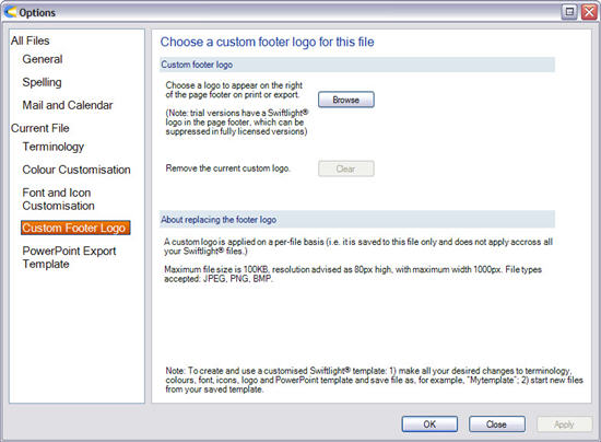
Custom Footer Logo
In fully licensed versions of Swiftlight, you can add a custom logo which will be displayed on the right side of the footer on printed or exported outputs. To add a custom logo to the current (open) file, simply click on the Browse button and select the logo file. Provided the logo meets the specifications it will be scaled to fit the available space and will be saved within the file. (See Creating a Template for how to use a custom logo across multiple files).
Custom logos must meet the following specifications:
- Allowed file types are: JPEG, PNG, BMP;
- Maximum file size is 100KB.
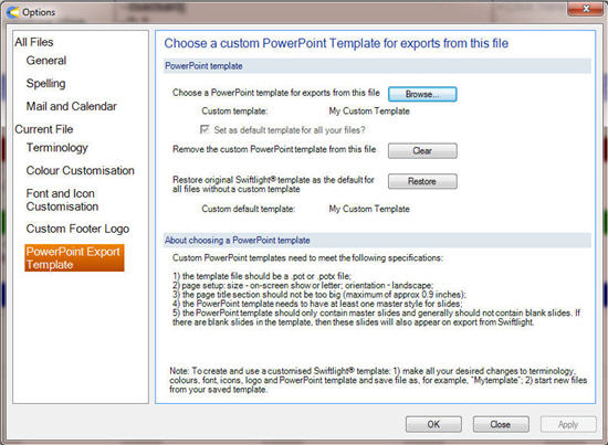
PowerPoint Export Template
When Swiftlight outputs are exported to PowerPoint or PDF, by default they will appear in a generic PowerPoint template with a white background, a blue line below the title section, no page footer information and with Arial font. This dialogue allows you to select your own PowerPoint template (e.g. your company’s) as the design style for outputs from Swiftlight. By selecting your own template, Swiftlight outputs will appear in a PowerPoint file which has the background colours, footers, font etc of your choice.
About selecting a template:
- First, make sure your template matches these specifications:
- The template file should be a .pot or .potx file
- Page setup for slides should be: size – on-screen show or letter; orientation � landscape;
- The page title section should not be too big (maximum of approx 0.9 inches), or the exported graphic will overlap with the title section somewhat;
- The PowerPoint template needs to have at least one master style for slides, and it may also have a title master. (If there is more than one master style for slides, Swiftlight will use the first master slide in the list).
- The PowerPoint template should only contain master slides and generally should not contain blank slides. If there are blank slides in the template, then these slides will also appear on export from Swiftlight.
- Then click on the browse button and select the template file. When it is selected you will see a picture of it displayed in the dialogue.
- You also have the option to make your template choice the default template for all your Swiftlight files, by checking the box.
- When your choices are complete select OK or Apply.
- Note: your choice of template for this file applies only on your computer. If you send the Swiftlight file to someone else, their template choices will determine how the outputs from the file will appear on export.
About resetting the templates:
- To clear a custom template from this file, press the "Clear" button. This will remove the custom template and the file will start using whichever default template you have in use, which will either be a template you have selected previously or the default Swiftlight template.
- If you have a custom default template set up and want to change it, you can either:
- Over-write it by selecting a different custom template for a particular file and selecting the check box to have it apply to all files. Or;
- Delete it and return to the original PowerPoint template provided by Swiftlight, by pressing the "Restore" button.